Introduction
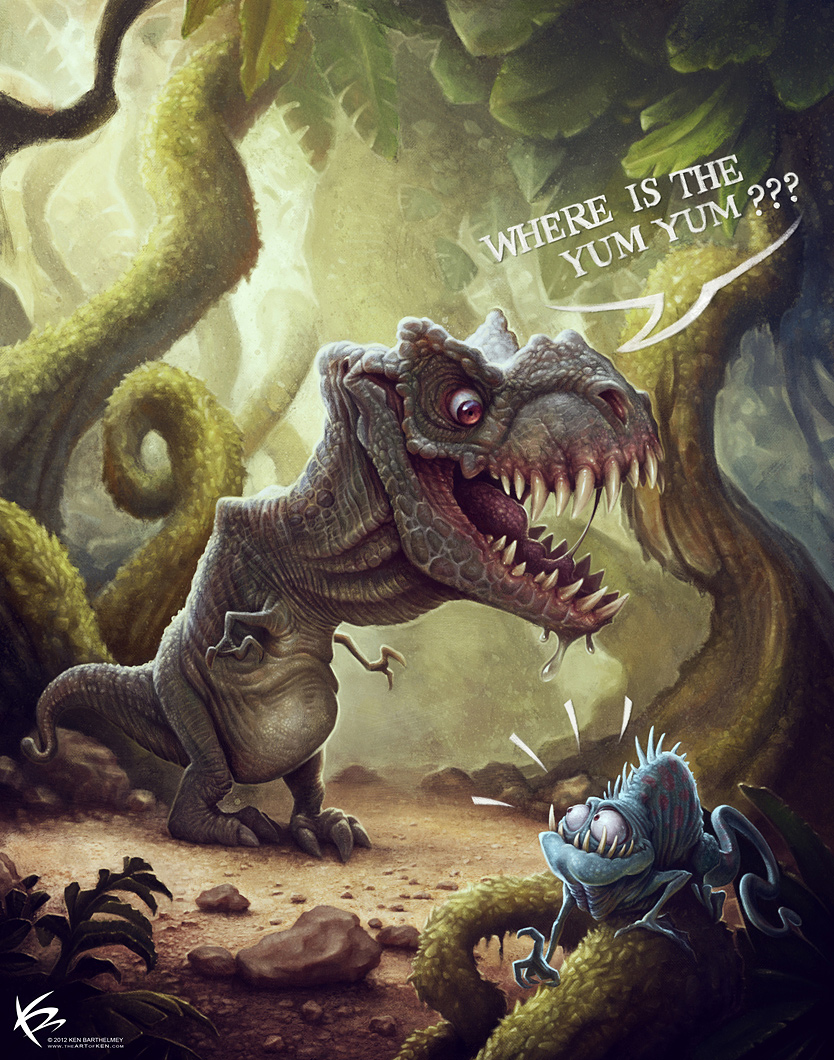
Hi there! In this tutorial I will talk about the working process I used to create my latest picture, Where is the Yum Yum???.
The picture shows a funny T-Rex searching for his food. It was my intention to create a perfect balance between realism, characterization and humor.
Sketching
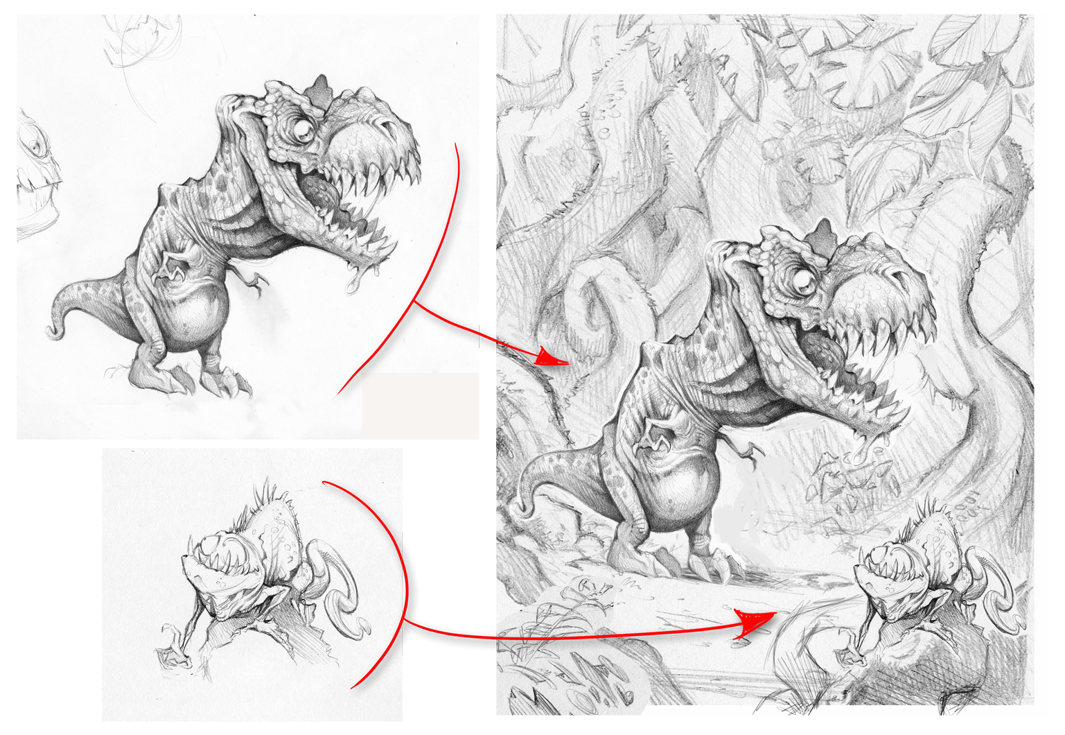
At the beginning, I usually create several thumbnails to find a good composition. I finished the dinosaur drawing itself a long time ago and when I came across it again, I thought it would be good enough to justify making an illustration with the dinosaur as the focus.
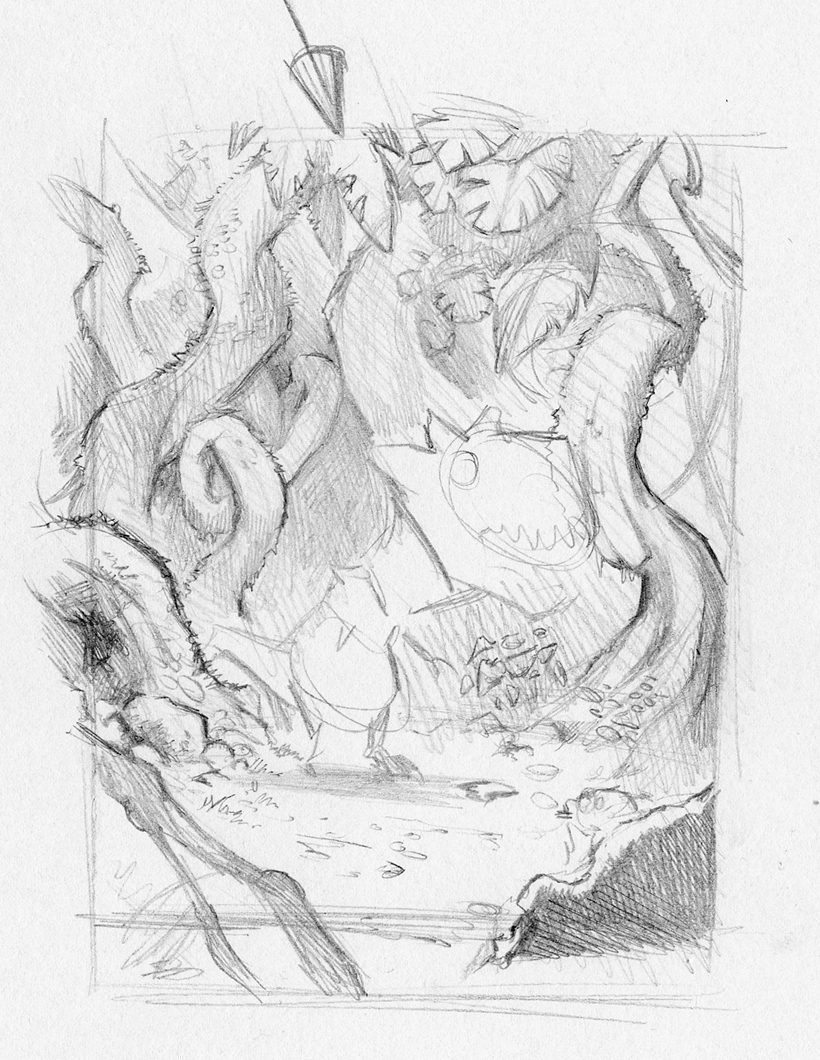
I began to make a couple of environment sketches. It's very useful to make a lot of pencil sketches first. You can put them together afterwards in Photoshop (Fig.02). The sketch sort of serves as a guideline, thus it's easier for me to color the picture afterwards.
Basic Colors
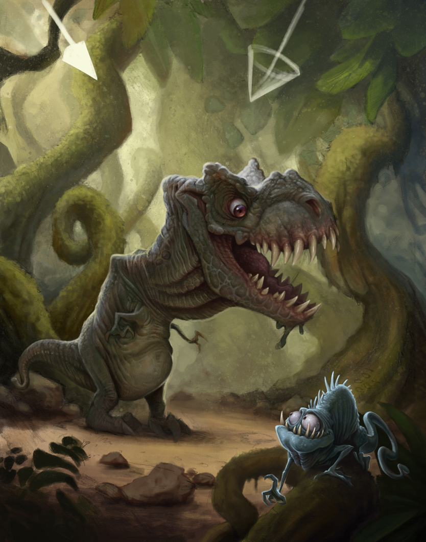
Now, it was time for one of the most important points: the colors. The technique I use is similar to what you use when working with traditional oils or acrylic paint. I work from dark to light. At this stage, it's very important to choose the right colors because the drawing is built upon this color palette.
I changed the layer of the sketch to Multiply mode (by doing this, I can paint beneath the sketch) and placed another layer under the Multiply sketch layer for the basic colors.
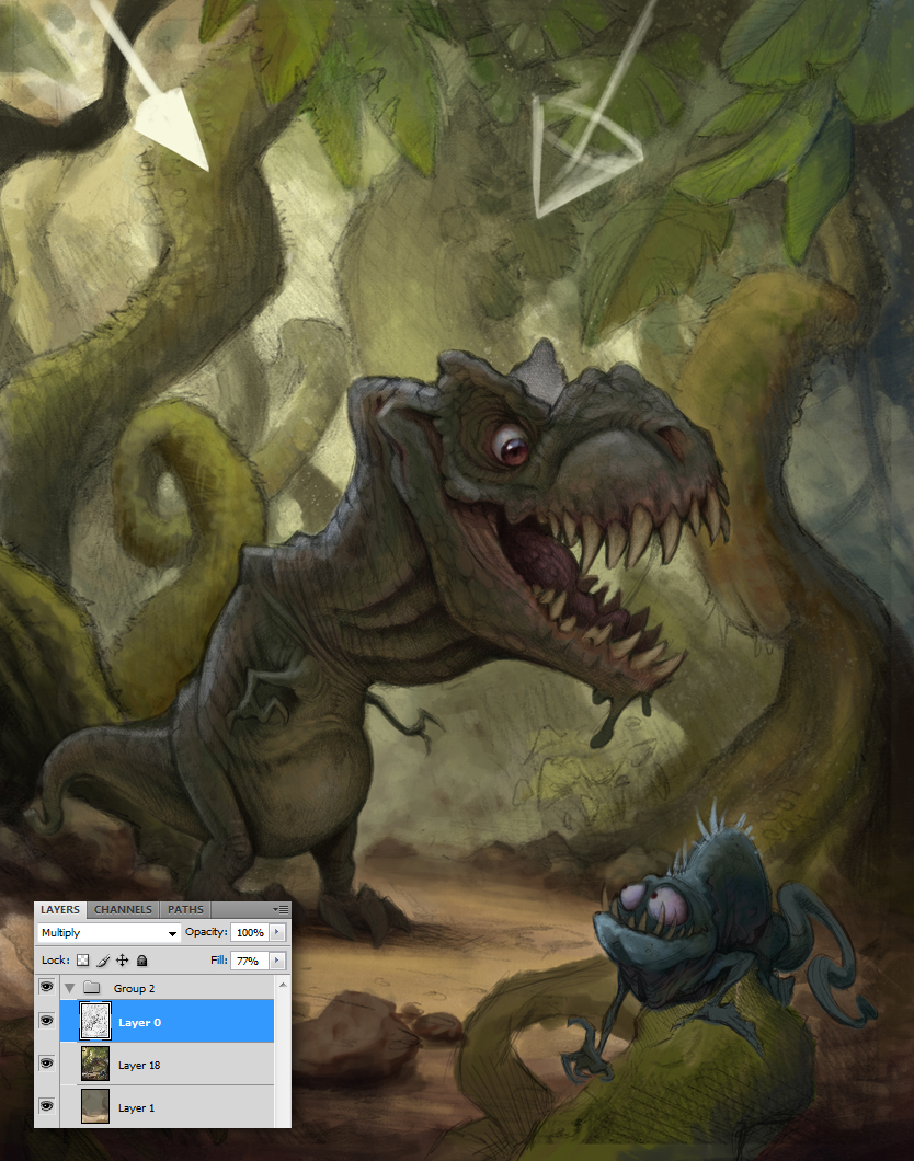
Mini tip: I always paint small directional arrows on a separate layer. They show me where the light comes from and where the shadow has to be.
Amplify the Picture
The drawing looked a little bit more alive now than it did before, but it was still far from being finished. I created a new layer in Normal mode and thus painted above the sketch. I prefer messy-looking images to perfect ones, so I used different brushes to create that effect (Fig.04). Mike Nash, who is an amazing artist, offers a lot of fantastic brushes on his website for free.
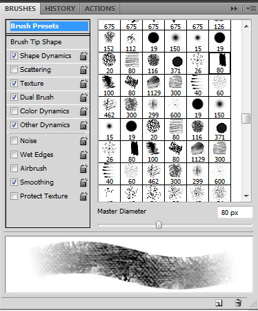
Using different brushes gives the drawing a more artistic look so that it doesn't look too digital. During this stage I think it's important not to draw in too many details; the most important things are the atmosphere and lighting (Fig.05). Therefore I didn't zoom in on the picture so that I had a full view of it. With the Color picker I chose the basic colors that I had already devised and changed them to that effect. I used a lot of different layers for that because if I made a mistake, I could then very easily and quickly correct it.
Details
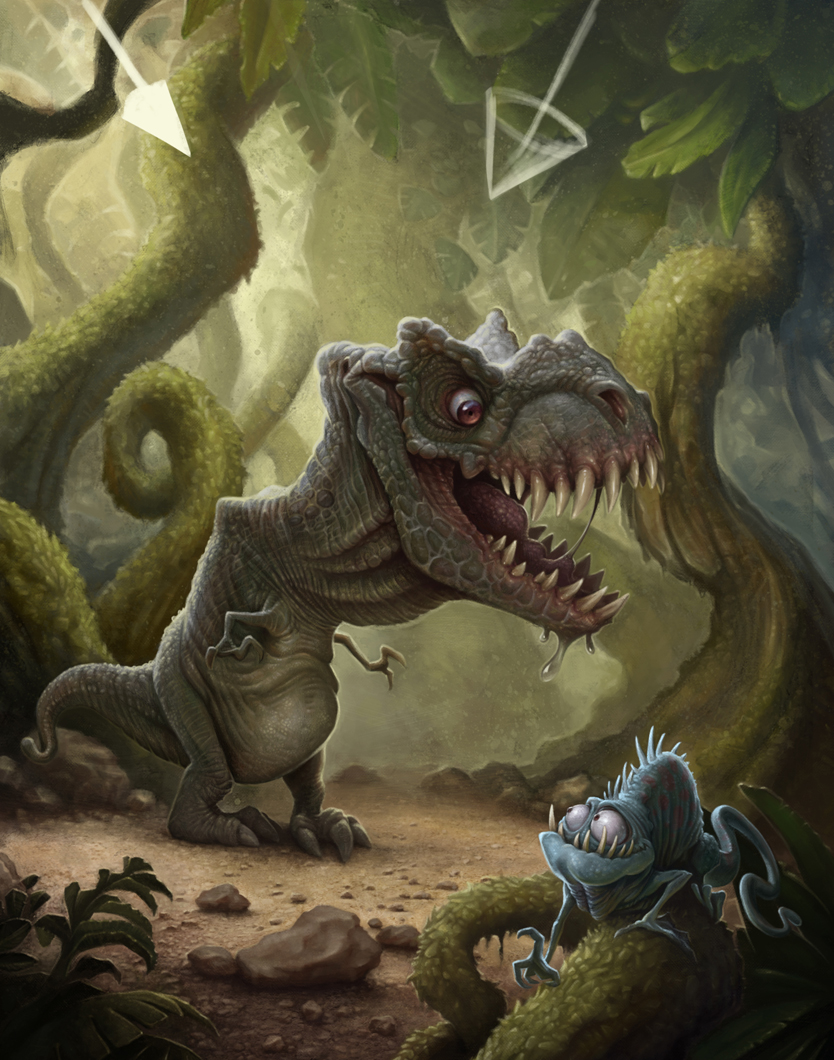
Now, the detailed work began. As you can see, I love painting details and textures; this part is the most fun to me and, accordingly, takes the most amount of time. Adding details and textures gives the picture a realistic look, but it's important that the details always fit the picture as too many details can destroy the realistic look. If you draw a lot, you develop a feeling for balance.
Color correction/ final touch
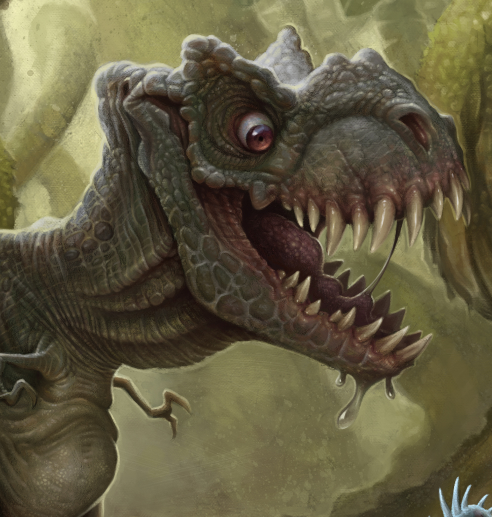
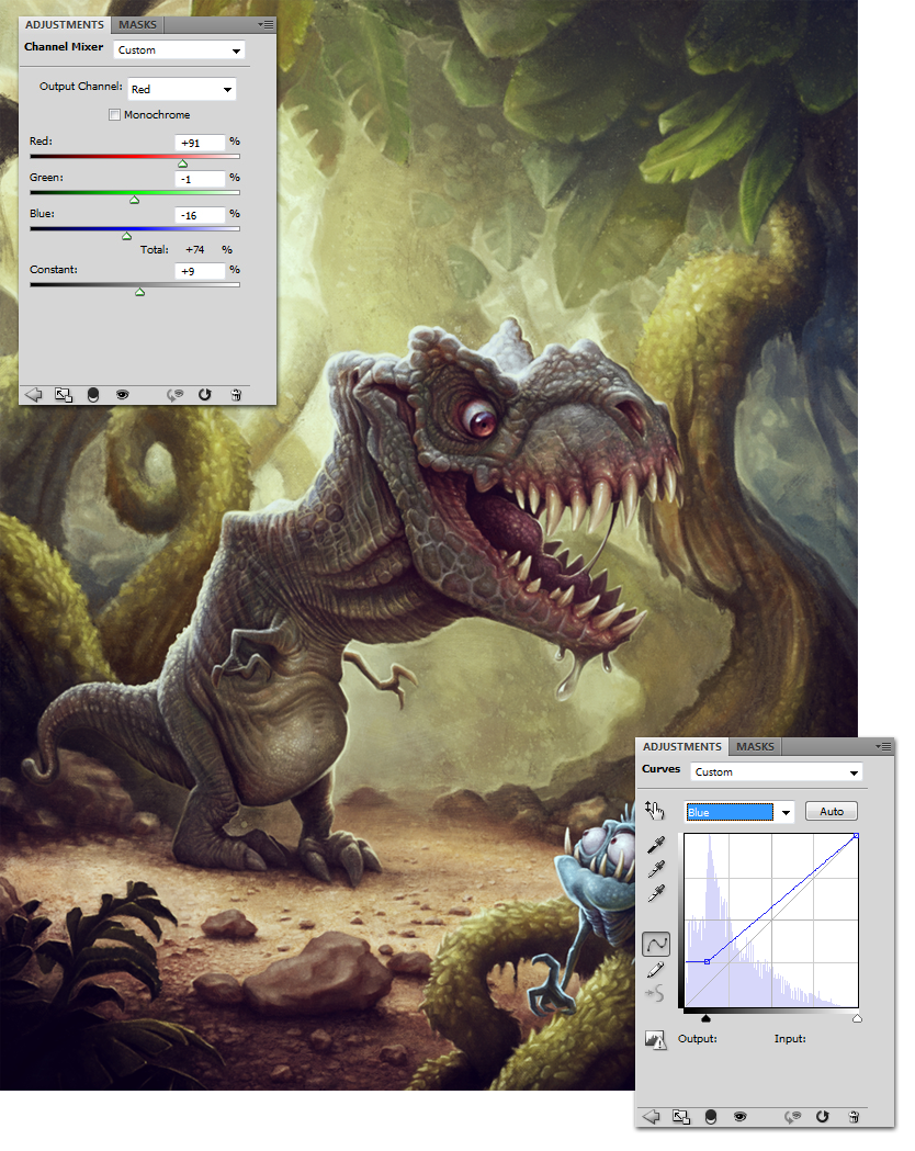
The picture now looked almost finished, but in some place it was too dark or not gaudy enough. These problems were easily fixed with adjustment layers. With the adjustment Curves, for example, I changed the contrast to a bluer color. Or with the Channel Mixer I changed the lightning colors a bit – you can check it out in Fig.08. So that the picture appeared even funnier and the characters more alive, I added some speech bubbles.
Closing Words
Now, the picture was finished – I hope you like it! And I hope this article was useful and fun to read.
You can read the tutorial also on CGArena.com and 3DTotal.com
